Cottage Check Oatmeal & Ivory Gingham Duvet Cover – Warm Country-Inspired Pattern for a Welcoming Bedroom
Cottage Check Oatmeal & Ivory Gingham Duvet Cover – Warm Country-Inspired Pattern for a Welcoming Bedroom
Made in the USA
Made to meet high U.S. quality standards.
Fast & Reliable Shipping
Ships within 24 hours with tracking updates.
180-Day Money-Back Guarantee
Not satisfied? Get a full refund within 180 days.
Visible Anti-Aging Benefits
Helps Reduce Wrinkles, Fine Lines & Puffiness
Gentle on Skin
Designed for a comfortable skincare experience.
Fast, Lasting Results
See visible results in as little as 7 days.
Couldn't load pickup availability

🏡 The beginning of a more welcoming bedroom
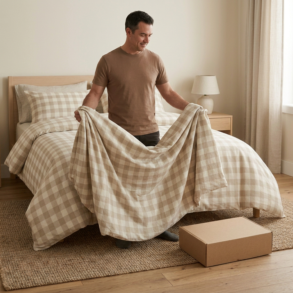
There is a familiar warmth to gingham, especially when its colors stay close to oatmeal and ivory. Cottage Check takes that recognizable pattern and gives it a place in a light, uncomplicated bedroom. It is a country-inspired concept without the need for an elaborate theme: a checked bed, warm wood, a simple lamp, and room to make the space your own.
The pattern is the starting point, not an instruction to match everything. Its repeated light and darker squares bring a little order to loose bedding folds, while the neutral palette leaves space for different furniture styles. A city apartment can borrow the same idea just as easily as a cottage-inspired guest room.
A room recipe, not a matching-set rule
Begin with the oatmeal-and-ivory check as the main pattern. Add a plain light sheet, then choose a wood tone that feels comfortable beside the warmer squares. Keep curtains quiet, and use one woven or textured object to introduce a different surface. The bed already supplies a repeated motif, so the surrounding pieces do not all need patterns of their own.
For a more rustic direction, introduce a darker timber bench or a simple basket. For a cleaner contemporary version, use a light wood bed frame and a plain cream wall. Both arrangements let the checks remain the most recognizable detail, while the room's character comes from the objects around them.
Why the check feels different from a stripe
Instead of one continuous line direction, gingham creates a repeated grid of light, mid-tone, and warmer intersecting areas. That gives the cover a more rounded, familiar visual rhythm. Across a dressed bed, the squares bend and change perspective with the folds; in the folded product view, the repeat becomes easier to examine.
The concept uses a medium-looking check, not a tiny micro-print or oversized bold block. Exact repeat dimensions are not yet specified. Production alignment, scale, and whether the pattern is woven or printed must be confirmed with a real sample before those details are described as product specifications.
🧺 Make the styling feel lived-in
Turn back the top of the cover loosely rather than creating a tightly pressed band. Let a small amount of natural movement remain near the foot of the bed. Use plain accessories to break up the repeat if you prefer a quieter arrangement, or repeat a similar warm beige in a lampshade or ceramic vase.
A small accent in muted green or dusty blue could add a different note, but it does not have to become a new color scheme. The oatmeal and ivory pairing is already the core of the design. Keeping most large surfaces neutral allows that pairing to stay clear.
Look closely before choosing
The main room scenes show the overall gingham direction. The detail images explore the proposed fabric appearance and folded edge, and the white-background image removes the room styling so the cover and packaging can be considered separately. The model views are another way to present the textile, not a source of exact dimensions, weight, or thickness.
The proposed surface is matte-looking and simply finished, without a raised tufted motif, quilted decoration, or ruffled border. Its interest comes from the check pattern. The actual fiber composition, hand feel, edge construction, and closure are still to be established.
What comes with this concept
The planned listing is for one unfilled duvet cover only. An insert, pillowcases, pillows, sheets, and room accessories are excluded. Some styled scenes include coordinated checked pillows to illustrate a decorating possibility; those pillows and their covers are not part of the item.
The packaging direction is the same plain kraft-colored rectangular box used throughout the series. There is no visible logo, promotional sticker, printed slogan, or ribbon in the concept. The final box dimensions and packing arrangement have not been approved.
A few practical details still need a real sample
Before release, confirm the cover's width and length against the intended insert. Review pattern consistency across the face and at the seams. Check the closure, any internal fastening system, and the supplier's approved care label. Do not infer a wash temperature, tumble-drying setting, shrinkage allowance, or colorfastness result from an image.
This draft is illustrated with AI-generated concept imagery rather than verified sample photographs. Materials, dimensions, construction, care instructions, packaging, and performance remain unverified. No certification, hypoallergenic, cooling, or durability claim is made.
Cottage Check is a warm visual direction for a room that should feel personal rather than overly coordinated: familiar checks, a gentle neutral palette, and enough flexibility to work with the pieces already at home.